Hi,
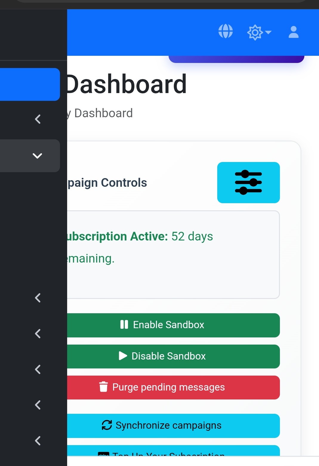
changed the sidebar appearance options and now on the mobile devices, the sidebar is not behaving correctly:
also modified the page load function to not apply the settings to mobile devices, and just use the ones setup in the advanced settings
function Page_Loading(): void
{
    if(!IsMobile()) {
        Config("BODY_CLASS", " transition layout-footer-fixed layout-fixed fixed-header sidebar-expand-lg sidebar-mini sidebar-collapse bg-body-tertiary reduce-motion app-loaded");
        Config("SIDEBAR_CLASS", " main-sidebar sidebar-dark-blue ");
        Config("NAVBAR_CLASS", " main-header navbar navbar-expand nav-collapsed navbar-dark border-bottom-0 layout-navbar-fixed ");
    }
...
}
what the mobile looks like, the menu items are "active" even thought they are invisible, and the side panel doesn't slide open/closed
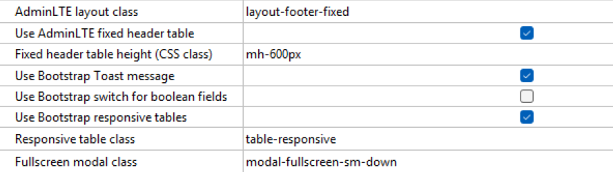
advanced settings:
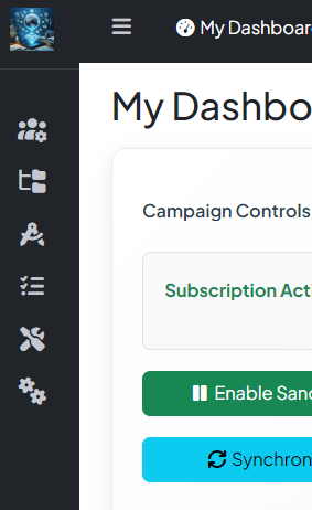
what it looks like on desktops:
just trying to figure out settings compatible with mobile devices. the prior setup was working, but then changed to displaying the "collapsed sidebar with mini icons", or should i setup an "else" with sidebar-collapse and mobile friendly settings?
seems like whatever i try, the ui doesn't change
thanks